


L O V A R O
What: Product Design & Branding Consultancy
When: 2011–2022
Where: Brooklyn & Manhattan, New York
LOVARO was a multi-disciplinary product design, creative direction, and branding agency with 10+ years of experience leading projects within the luxury beauty, technology, transportation, and lifestyle industries.
A L L E N & R O B E R T
In 2011, Allen Zadeh and Robert Foote III established a human-centered design studio focused on developing process-oriented strategy, direction, and design. The team converted key insights into practical, visually appealing results that not only helped clients but also transformed markets and enhanced the human experience.
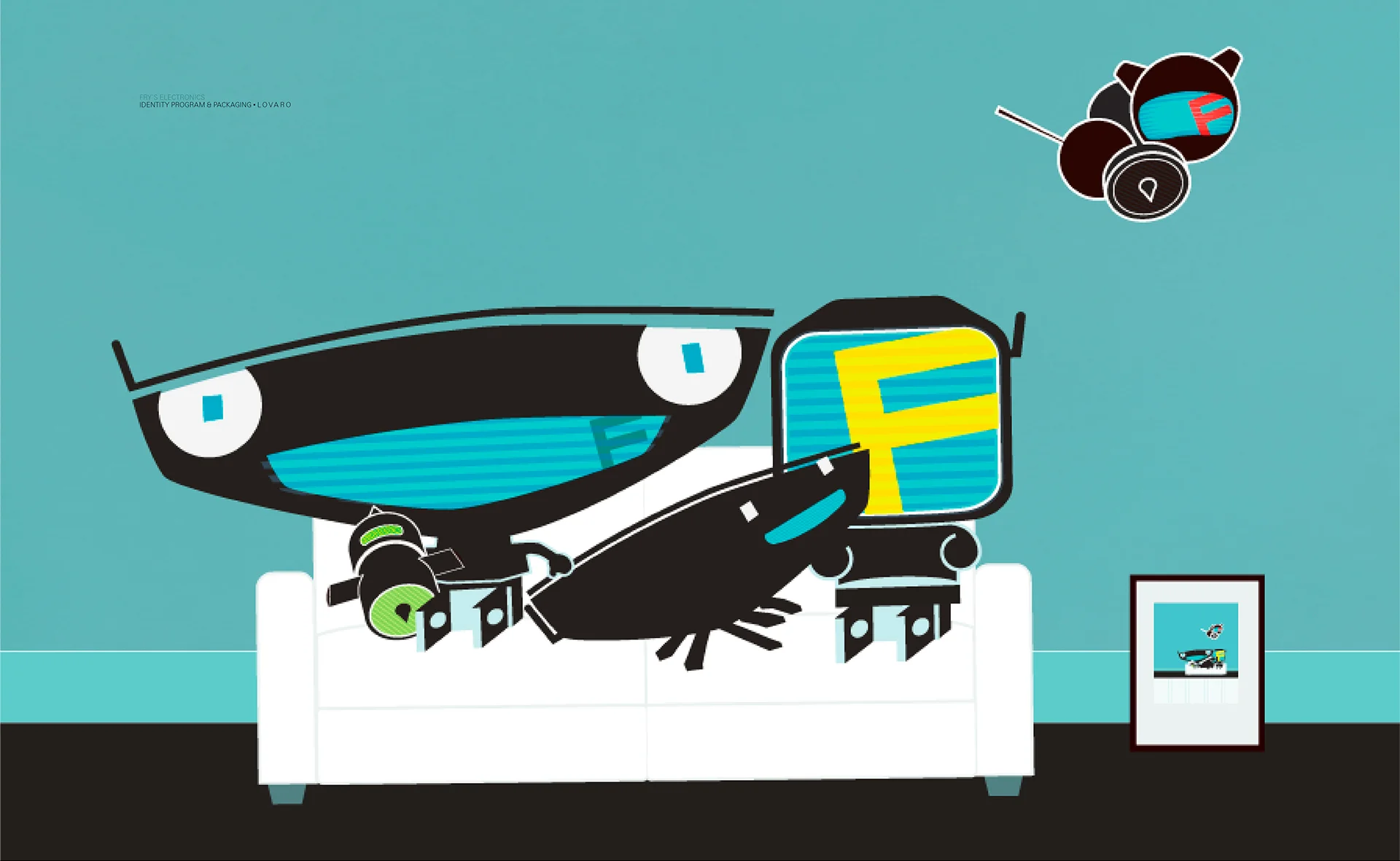
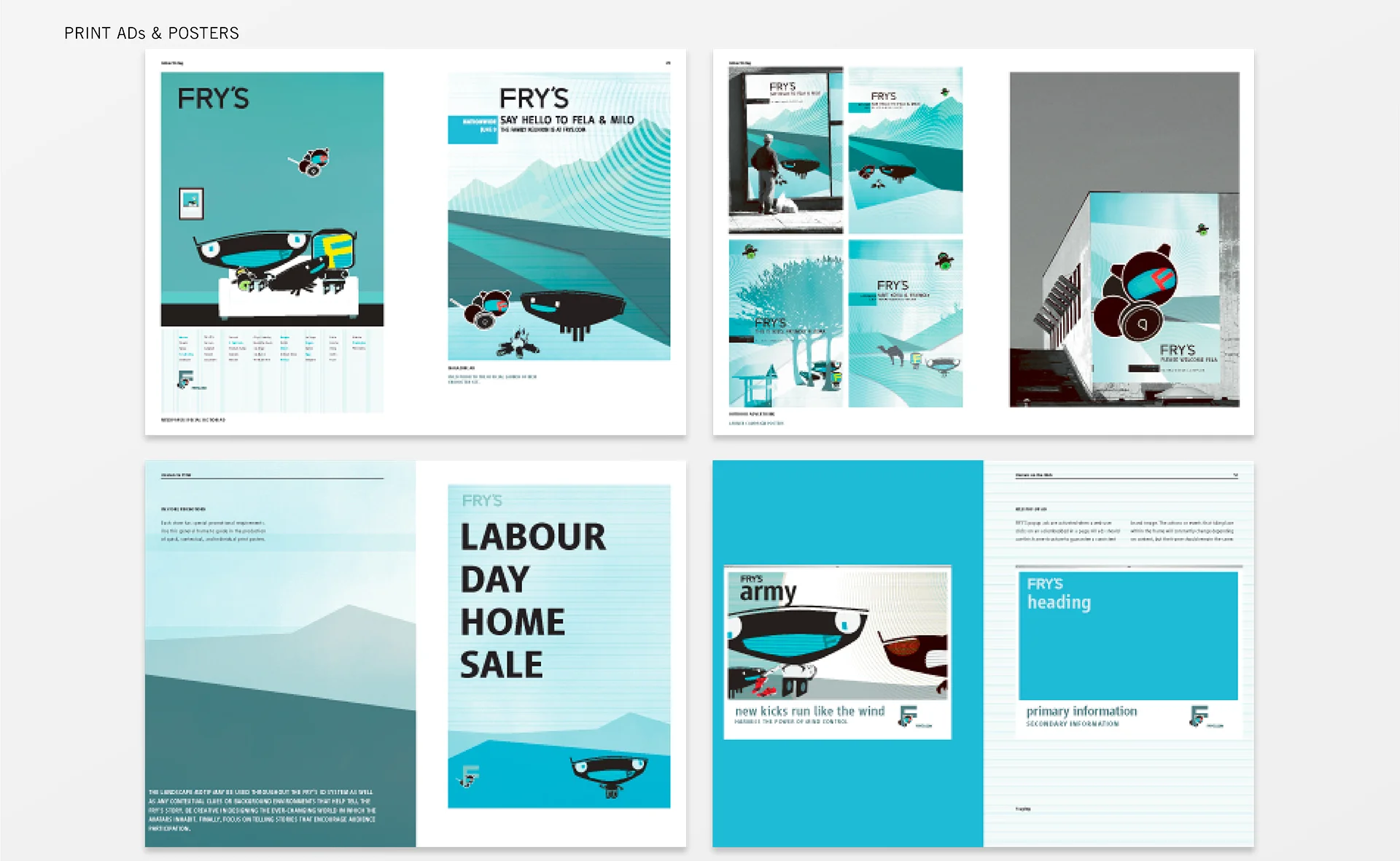
Their personalized ‘small shop’ strategy cultivated reliable client relationships, sharp attention to detail, and improved design results. The studio collaborated with companies on a contractual basis, involving focus specialists as needed to achieve excellent outcomes. LOVARO’s areas of expertise included design strategy, naming, graphic identity, transportation, consumer electronics, and brand experience design.
In 2013, the duo established LOVARO.mobility, a division dedicated to research and development in local transportation solutions. Allen and Robert sought to develop innovative, high-performance mobility technologies tailored for daily activities like running errands, shopping, traveling with children, transporting passengers, or socializing with friends.
C L I E N T S
Beauti Control
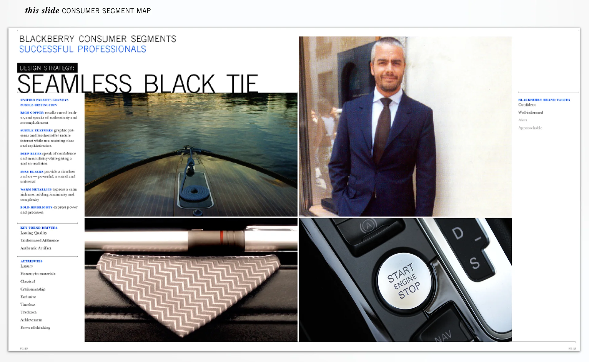
BlackBerry
Bloomberg
Burton
Coty
Direct TV
Hulet Packard
Imagine
Intel
Inter Parfums
Jabra
Johnson & Johnson
Microsoft
Neat
Nike
Nissan
NYC TLC
Omhu
OXO
Panasonic
Porsche Design
P&G Prestige
Renault
Timberland
Toyota
C O N T A C T
Email